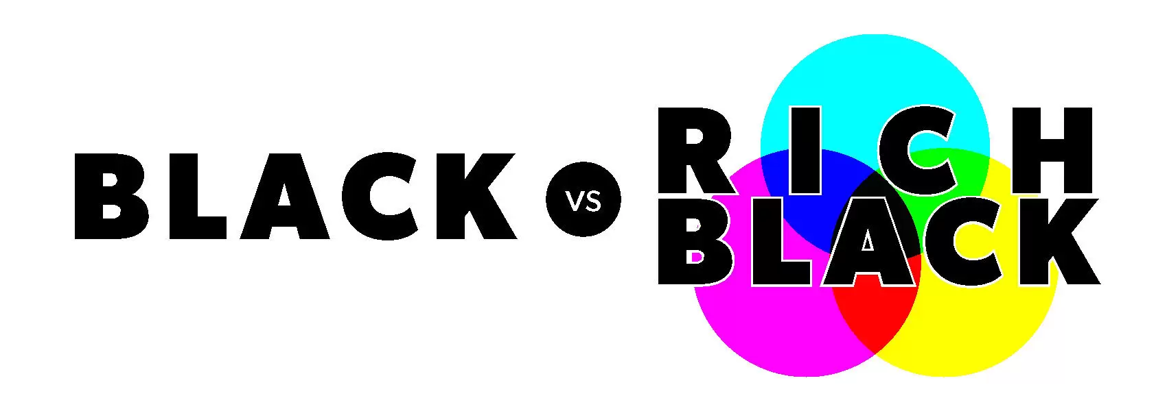
Standard Black vs. Rich Black
This article explains the difference in standard black vs. rich black in offset printing.
Since launching in 2009, PrintNinja has been the premier source for offset printing services. During this time, PrintNinja has printed over 6 million comic books, tabletop games, children’s books, art books, photo books and graphic novels for thousands of independent creators, publishers, and businesses. As the foremost offset printer, we’re here to help you through every step of the process.

Files Printed Rich Black (Top) and Standard Black (Bottom)
The black produced in black-and-white printing differs significantly from the black produced in full color CMYK printing. When creating your design, keep in mind that there are two types of black: standard black and rich black. Standard black uses only black ink (100% K), whereas rich black contains elements of other colors (Cyan, Magenta, Yellow). Because rich black uses more ink, the resulting color will be deeper and more saturated. If you are using rich black, then we highly recommend you visit our ink saturation guide.
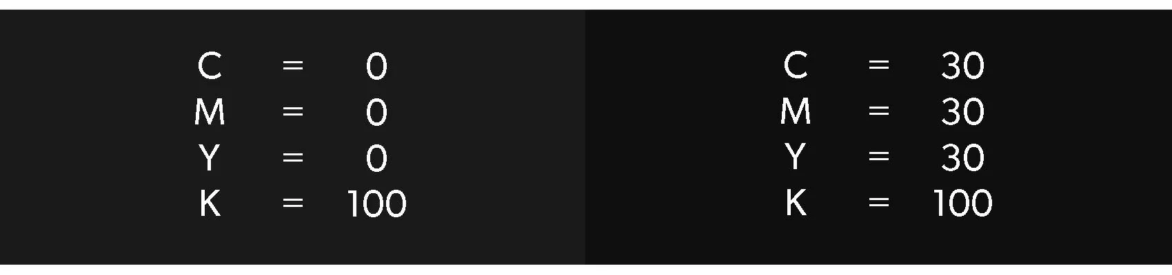
The two might look the same on your screen, but they won’t on paper. In print, the difference will be something like what you see below. Be sure to check the values for each color in all your blacks for the sake of consistency.
Standard Black (K) vs. Rich Black (CMYK) Values
When Not to Use Rich Black
The one time you do not want to use rich black, even in a full color CMYK project, is for very delicate lines such as small text or line art. The microscopic variations in plate registration between the 4 colors can cause slight color shadows to appear around the text, called ghosting. This is prevalent in newspaper printing.

Ghosting as a Result of Using Rich Black with Fine Text
Ghosting Example
On the left you can see ghosting due to the thin text and black background being set up as CMYK profiles (rich black) instead of grayscale (standard black). Because rich black is made by four plates distributing ink on top of each other, there can be a slight variance with one of the plates being slightly off. In the photo, you can see the result when the magenta plate shows variance. The variance is especially obvious when the text is thin. If the black was set as standard black (grayscale), then only one plate would be needed and ghosting wouldn’t be possible.
Ready to Get Started?
We’ve created a custom pricing calculator so that you can explore all the different printing choices, shipping methods, and get an instant price for your project. You can also customize just about anything, from size and paperweight to specialty options and so much more.
Explore Your Options